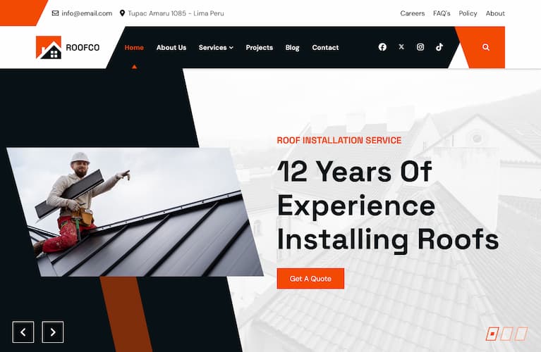
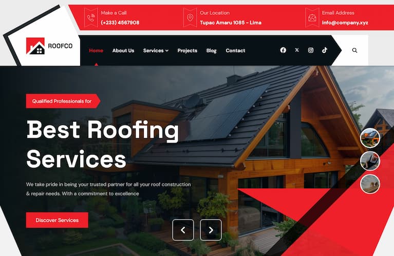
Download all Joomla templates including quickstart (demo)only $29

Forum

Important - Hands Up!

- Please ask using the account with which you made the purchase or download of our products and in its respective category.
- If you bought our products in another market, ask your questions in that market, not here.

* ADD PRODUCT NAME IN START OF SUBJET

Resto Template - Menu (navigation) is gone...

  • K
  • kkunz New Member
  • Topic Author 2 weeks 3 days ago #1
Hello,
I'm 99% finished with my website and now I wanted to add a mobile logo to the Helix window. After saving, the navigation disappeared.
I had edited the "ut_resto - Default". When I switch to the "ut_resto - Home 2", the navigation is displayed again, but the layout doesn't match, of course.
Even in the HTML source code the SP_Navigation is no longer displayed.
Also, one color in the layout changed, but only one color; the rest matches the CSS color code I created.
very mysterious.. What can I do?
This message contains confidential information


Thanks for support.


Please Log in or Create an account to join the conversation.

  • L
  • leoalv Moderator
  • 2 weeks 3 days ago #2
Hello.
This is a known bug that was introduced with Joomla 5.2.4. To fix this, Helix released a new version, 2.1.2. You need to update the plugin from System >> Update >> Extensions. You can then edit your template style and activate the header you had selected.
Please double-check which options you had disabled so you can re-enable them.
We're sorry, but this wasn't our fault, but Joomla's.
Regards

Please Log in or Create an account to join the conversation.

  • K
  • kkunz New Member
  • Topic Author 2 weeks 3 days ago #3
Thank you very much, that got my navigation bar back!

Please Log in or Create an account to join the conversation.

  • K
  • kkunz New Member
  • Topic Author 2 weeks 3 days ago #4
I still have a question regarding the navigation: It's a bit wider for me, and if the screen is <1400px, there's not enough space and it slides under the header.
Is there a way to make the logo smaller then – or to simply always show the off-canvas menu on screens smaller than 1400px?

Please Log in or Create an account to join the conversation.

  • L
  • leoalv Moderator
  • 2 weeks 2 days ago #5
Hello.
The best solution is to better organize your menu items into submenus, or use single-word names for each item. This way, you'll have more space for the menu to fit better in resolutions lower than 1400px.

Now, if you prefer to keep it as is and hide the navigation bar and instead display OffCanvas in resolutions lower than 1400px, you can do so with CSS, but keep in mind that you'd be hiding the bar for a good percentage of laptops that use 1336px.

The OffCanvas button is hidden, but with CSS, you can make it visible and hide the bar. To identify the exact classes, you can use your browser's inspector. There's a Template Customization guide in our template documentation, which explains how to use it. But here's the CSS.
Code:
@media(max-width:1399.98px){ #sp-header nav.sp-megamenu-wrapper #offcanvas-toggler{display:inline-flex !important;} .sp-megamenu-parent{display:none !important;} }
You must paste this CSS into templates/ut_resto/css/custom.css if it does not exist you must create it.
Regards
The following user(s) said Thank You: kkunz

Please Log in or Create an account to join the conversation.

  • K
  • kkunz New Member
  • Topic Author 2 weeks 2 days ago #6
Great support! Thank you a lot!
:-)

Best regards
K

Please Log in or Create an account to join the conversation.